Discover how rust colour is establishing itself as a warm and bold shade in the worlds of design, decoration and visual communication. A shade that blends authenticity and modernity.

Long confined to discreet decorative uses, rust colour is now enjoying a real revival in the fields of design, fashion and even visual communication. Neither quite red nor quite orange, it evokes the patina of time, earth and authenticity. And if its return to favour is no coincidence, it is because it embodies new aesthetic aspirations.
A colour that tells a story
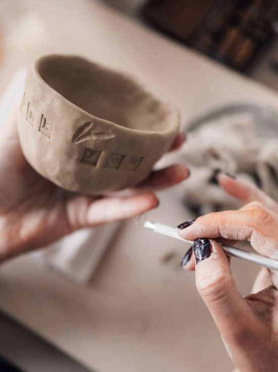
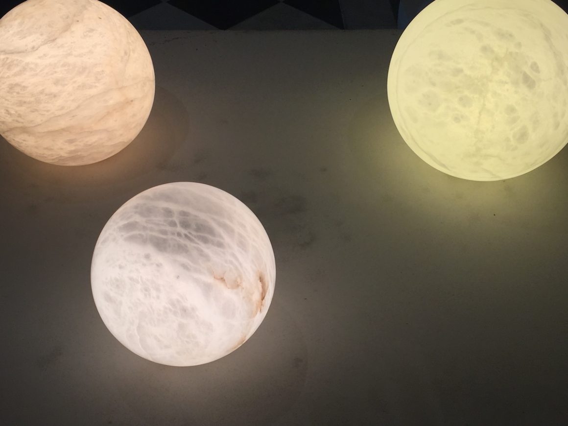
The first thing that appeals about rust is its lively, textured appearance. Unlike smooth or artificial shades, it is reminiscent of raw materials, oxidised metal, clay and aged leather. It speaks of transformation, warmth and substance. In this respect, it contrasts with the cold, digital tones that have long dominated the world of graphic design.
In an era where authenticity and naturalness are increasingly valued, rust stands out as a strong yet subtle choice. It is used to warm up a modern interior, to add character to a visual identity or simply to create a welcoming atmosphere without falling into cliché.
A rich palette of shades
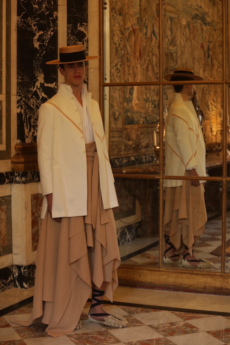
Rust, terracotta, brick, copper… These rust-like shades form a warm and versatile colour family. If you visit the page dedicated to the colour rust on Adobe Express, for example, you will find a specific colour code (#B7410E), accompanied by suggestions for combinations: analogous, complementary and triadic shades.

This technical approach, offered by online tools such as Adobe, allows creatives to easily compose balanced harmonies. It is not so much a commercial incentive as a useful reference point for graphic designers, decorators and communicators.
From decoration to graphic design
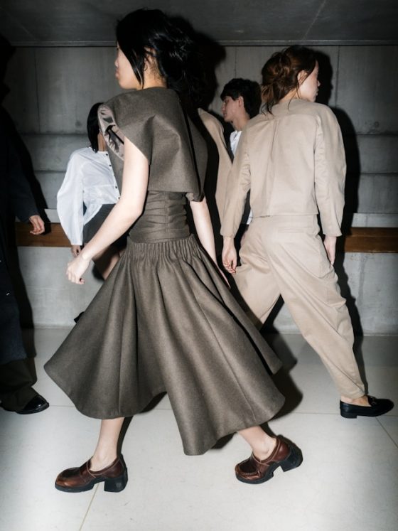
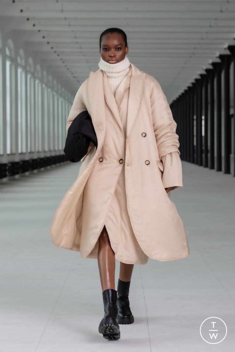
In the world of decoration, rust is now finding its way into fabrics, walls and everyday objects. Whether used in small touches or more assertive blocks of colour, it easily blends with neutral tones (beige, grey, cream) as well as more intense colours (deep green, midnight blue).
In graphic design, it anchors a visual in a certain temporality, neither too cold nor too flashy, expressing confidence and tradition, but also a form of elegant singularity.
A tone that leaves no one indifferent
Rust, combined with well-thought-out harmonies, embodies a strong trend between retro authenticity and inspiring modernity. It offers designers, decorators and content creators a rich, versatile and accessible visual tool. Admittedly, it does not appeal to everyone, but that is also its strength. It is memorable, atypical, and often part of bold visual choices.
Whether used in a brand context or interior design, it imposes a soft but assertive presence. Without being strikingly fashionable, it has a lasting impact on contemporary visual trends.


Follow us on Instagram